No Central Hub
New hires and external visitors had no single place to understand the full scope of Enthusiast Enterprises. Each division was its own island, with no connective tissue between them.
UI/UX Case Study
Building the central hub for a $1M+/day e-commerce network
Enthusiast Enterprises is the parent company of 9+ specialized automotive e-commerce divisions — including Custom Offsets, Fitment Industries, SD Wheel, MAPerformance, Vivid Racing, TrailBuilt Off-Road, Function Powersports, Mr. Wheel Deal, and SD Wheel Wholesale.
Together these brands generate over $1M in revenue daily and serve 800+ brands across 2M+ products. Despite this scale, there was no single web presence connecting them all. This project set out to change that — designing a unified digital hub from the ground up.
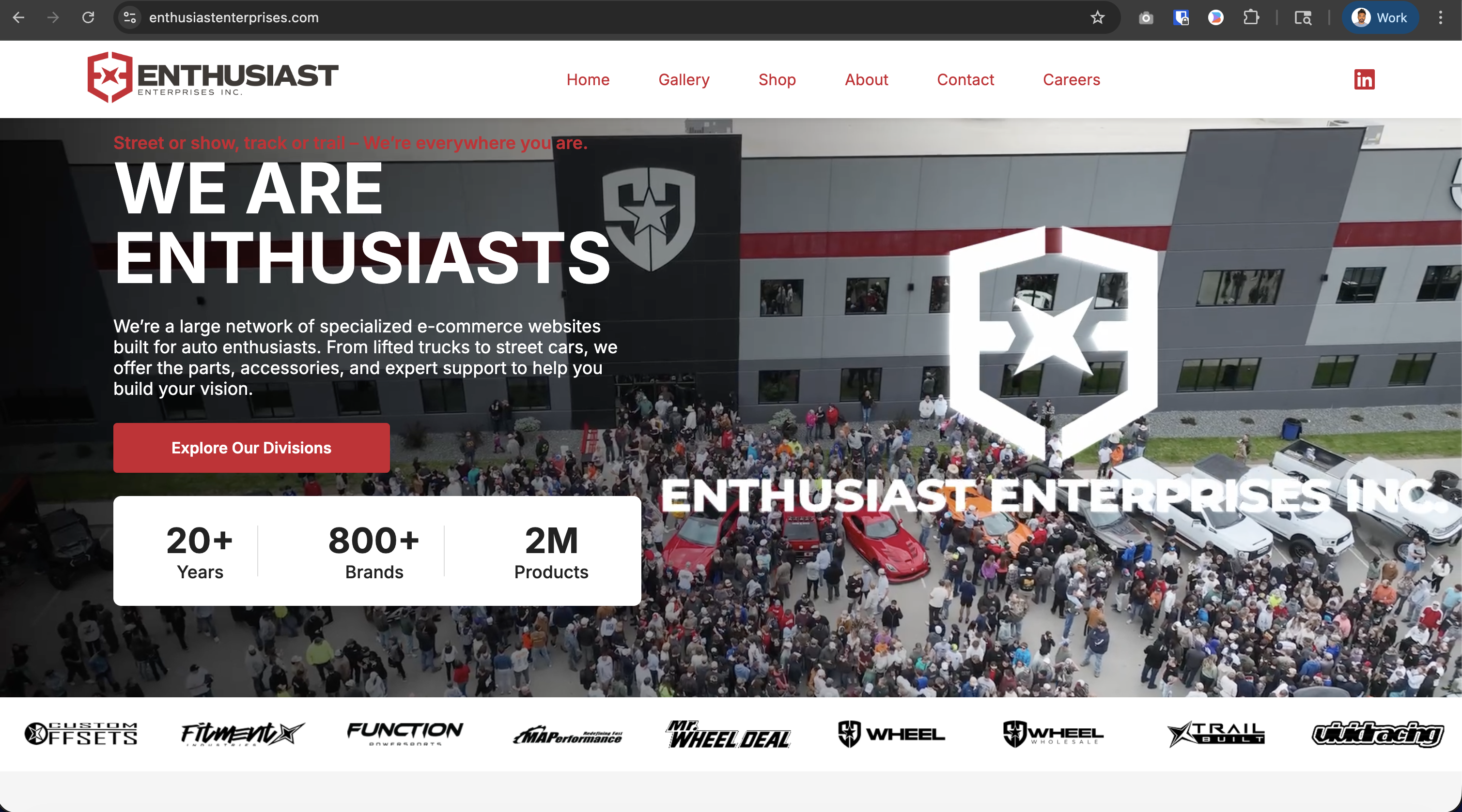
Before this project, the 9+ Enthusiast Enterprises divisions operated in silos. Internal communication relied entirely on Google Suite — emails, shared docs, and spreadsheets. There was no external-facing destination that tied the brand family together.
New hires and external visitors had no single place to understand the full scope of Enthusiast Enterprises. Each division was its own island, with no connective tissue between them.
Customers who were fans of multiple EE divisions had no way to discover or access related brands in one place, limiting cross-division sales opportunities.
Job seekers had no awareness that these 9+ brands were under one roof. There was no unified careers section, causing the company to miss out on talent who might qualify across multiple divisions.
To inform the design strategy, three comparable multi-brand parent company sites were analyzed against key UX criteria.
| Feature | Enthusiast Enterprises | Berkshire Hathaway | IAC | Genuine Parts Co. |
|---|---|---|---|---|
| Division Hub / Brand Directory | ✅ | ❌ | ✅ | ✅ |
| Centralized Careers Section | ✅ | ✅ | ✅ | ✅ |
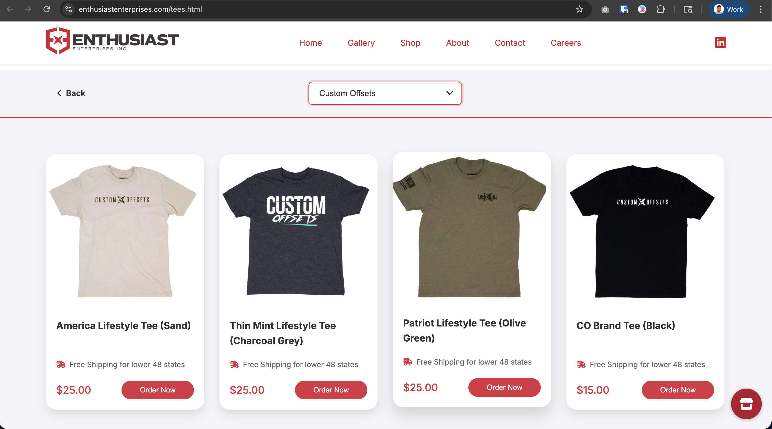
| Cross-brand Shopping | ✅ | ❌ | ❌ | ❌ |
| Mobile Responsive | ✅ | ❌ | ✅ | ✅ |
| Brand Storytelling / About | ✅ | ✅ | ✅ | ✅ |
"Most competitor parent sites lack cross-brand shopping or a visual brand directory. This was an opportunity to make EE's hub genuinely useful — not just a corporate landing page."
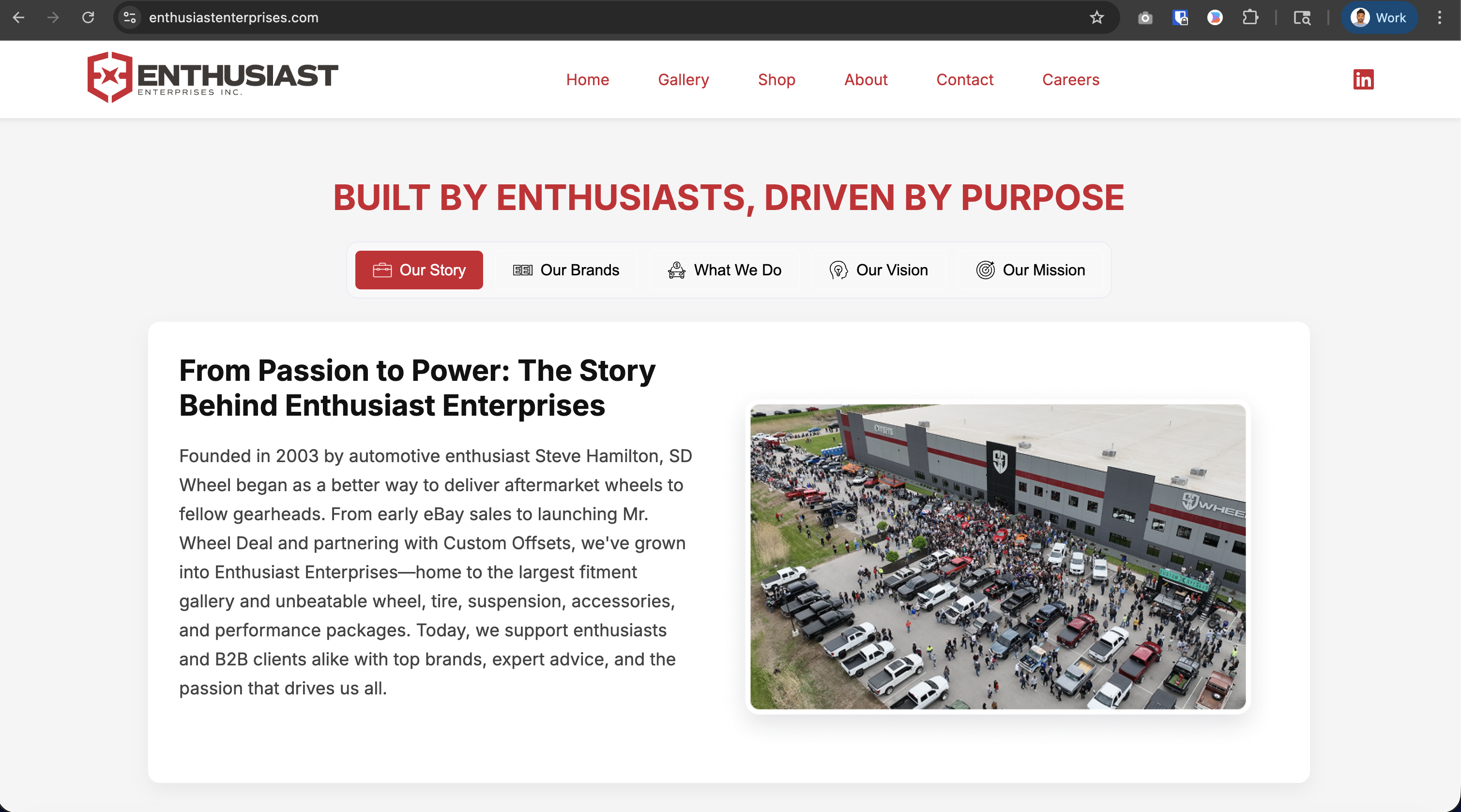
The site needed to serve 4 user types simultaneously while keeping navigation simple. The IA was designed around 5 top-level entry points.
With 4 user types and 9 divisions to surface, a deep nav structure risked overwhelming users.
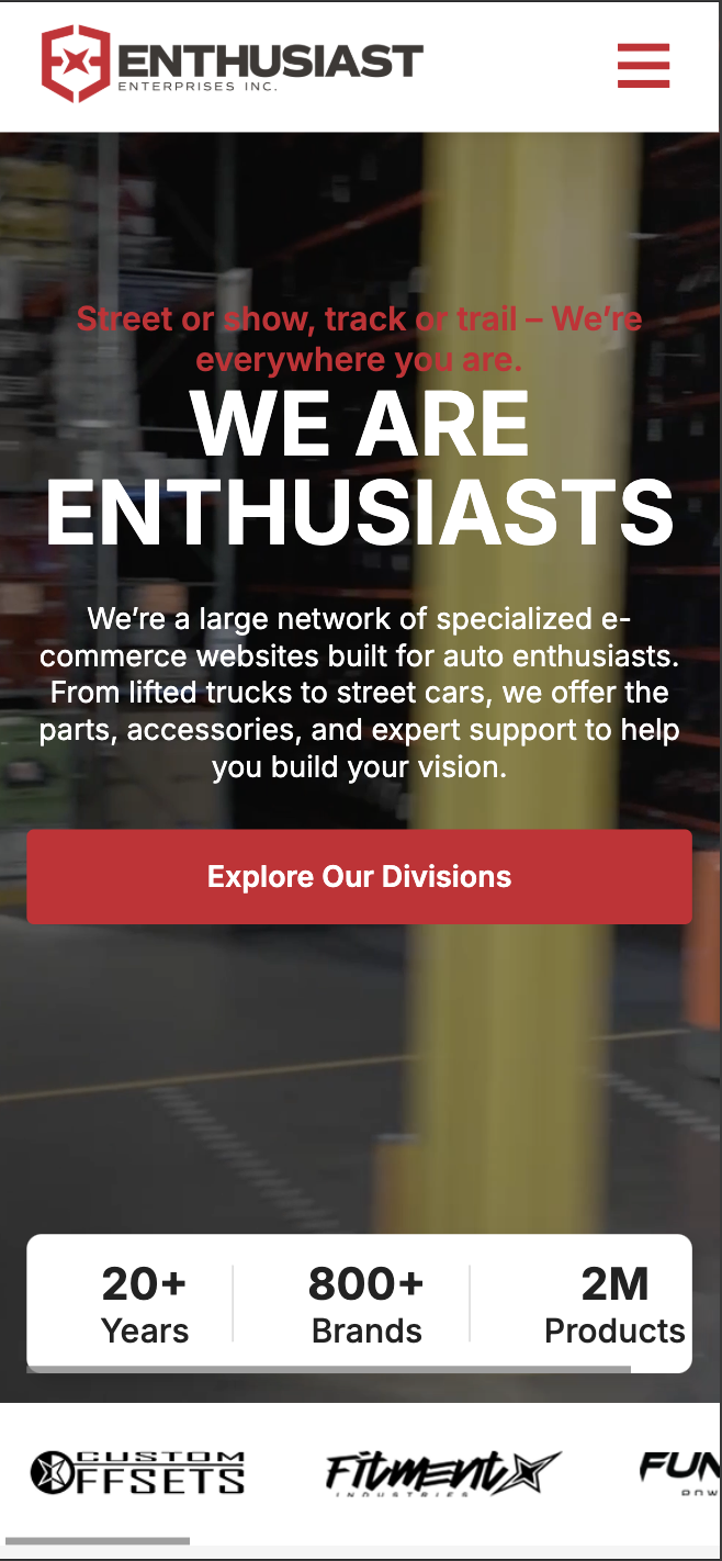
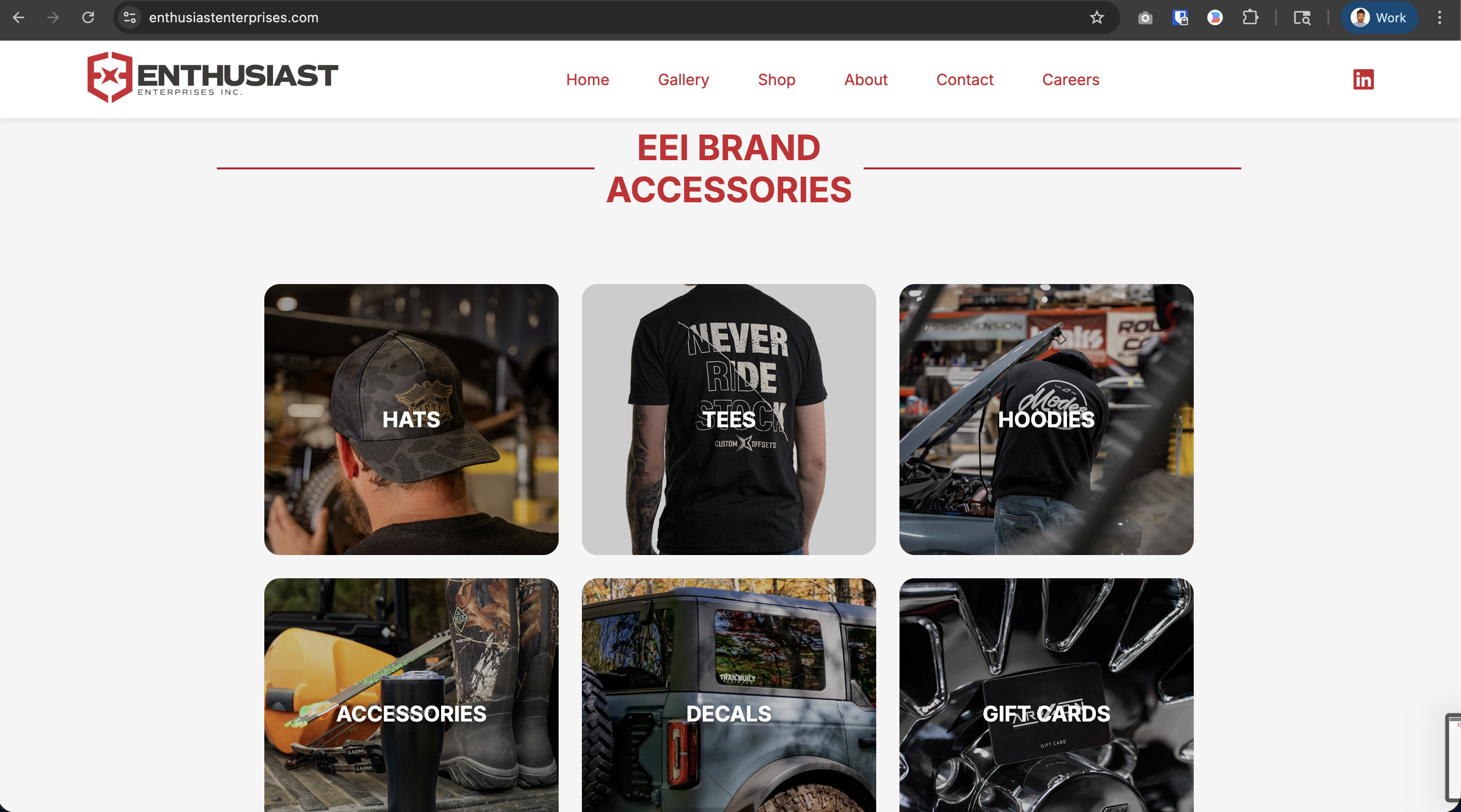
Chose a single long-scroll layout with anchor navigation so every user type could find their section quickly without drilling into sub-pages.
Reduced navigation complexity while surfacing all key content above the fold for each user group.
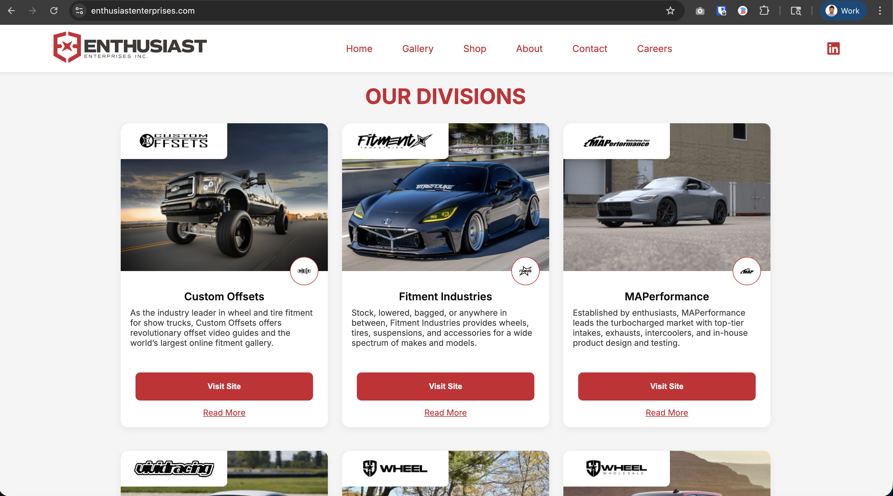
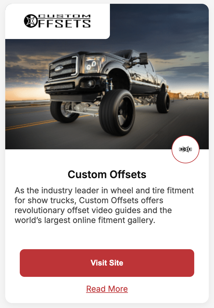
The 9 divisions each have their own logos, vehicles, and identities that needed to be respected.
Designed a consistent card component (vehicle image + logo + description + CTA) that respected each brand's identity while creating visual cohesion across the page.
Users can scan all divisions at a glance and click through to the right destination.
After building and delivering the Figma prototype and working code, the development team was hesitant to push the site live due to it being an entirely new web property.
Facilitated multiple cross-functional alignment sessions, documented design rationale clearly, and iterated on technical constraints flagged by the team.
Successfully launched the live site at enthusiastenterprises.com — turning a net-new idea into a real product.
💡 Designer's Note: "The hardest part wasn't designing the site — it was championing it. Getting cross-functional buy-in for a brand-new web property required clear communication, patience, and persistence."


Getting dev team buy-in required the same clarity and intentionality as the design itself. Documenting decisions, explaining rationale, and iterating collaboratively were essential.
With 9 unique brands, a strong design system — consistent card patterns, shared typography, unified color palette — was the only way to make the hub feel cohesive, not chaotic.
With 4 user types, every section had to work for someone different. Designing with multiple mental models in mind made the IA far more resilient.