Case Study · 2025

Custom Offsets
YMM Mobile Redesign

A data-driven, mobile-first redesign of the Year/Make/Model landing page that drove a +40% conversion lift over 6 months.

🏢 Custom Offsets 📱 Mobile UX 📈 CRO 🛒 E-Commerce ⏱ 6-Month Project ✦ Lead UI/UX Designer

01 — Overview

The Project

Custom Offsets is one of the USA's largest aftermarket wheel and tire e-commerce platforms, serving truck and SUV owners nationwide. The Year/Make/Model (YMM) landing page is the primary entry point for product discovery — and on mobile, it was underperforming.

Users struggled to navigate to sub-category pages, engagement was low, and conversion rates reflected that friction. As Lead UI/UX Designer, I owned the end-to-end redesign — from data discovery through stakeholder alignment, design execution, and post-launch measurement over 6 months.

+40%
Peak conversion lift
(Month 6)
+20%
Conversion lift
within Month 1
6mo
Continuous post-launch tracking
↑CRO
Consistent upward trend
Hero Image

Full-width before/after or project overview screenshot


02 — Problem

What Was Broken

Analytics and behavioral data painted a clear picture — mobile users were landing and leaving without converting. Three core issues were driving the drop-off.

📉

Low Engagement

Users scrolled past key CTAs without interacting. Heatmaps showed cold spots around product cards and session recordings revealed confusion between static and interactive elements.

🛑

Low Conversion Rate

High drop-off before YMM selector completion. Tap targets were too small for reliable mobile interaction and visual clutter competed with the primary purchase CTA.

🔍

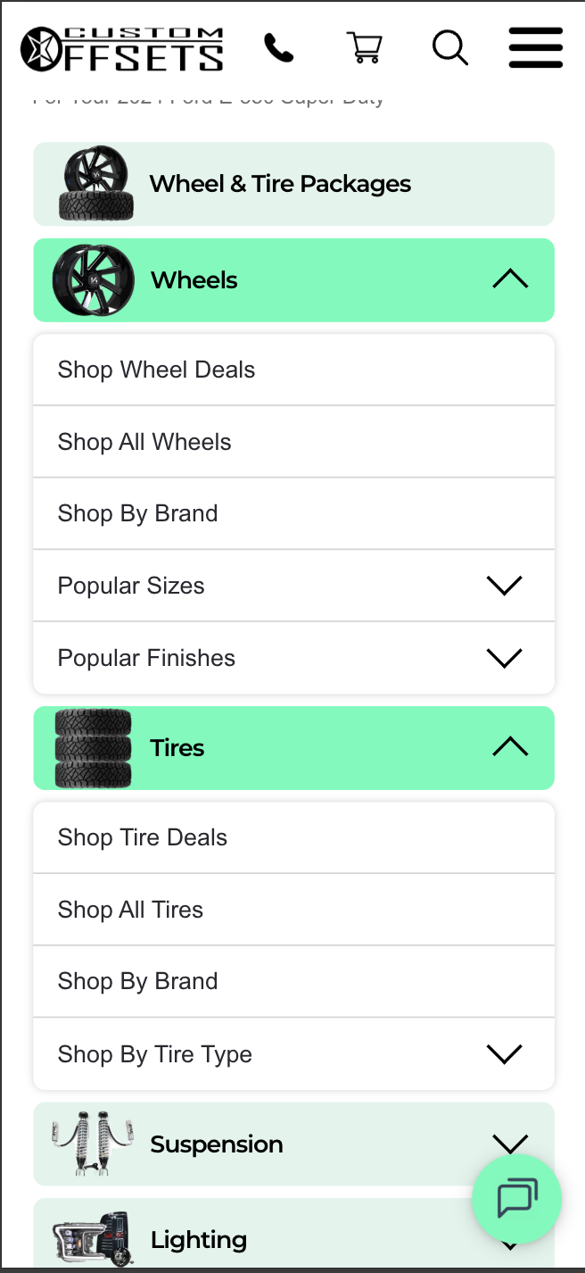
Hard Sub-Category Navigation

Sub-categories were buried in secondary navigation. The mobile menu was ordered for desktop conventions — there was no direct path from a landing card to relevant sub-category content.

"Users were arriving with clear intent, but the interface was working against them — three taps in, they'd already given up."
Before — original mobile landing page Before — original navigation or YMM selector state

03 — Process

Design Process

A structured 4-phase approach from raw data to measured outcomes.

🔎
Discover
Google Analytics + MS Clarity heatmaps & session recordings to surface real friction points
Data-Led
🎯
Define
Stakeholder workshops to align on priority issues, user goals, and measurable success metrics
Workshops
✏️
Design
Wireframes → high-fidelity Figma prototypes, iterated with internal team before handoff
Figma
📊
Measure
6-month post-launch CRO tracking and continuous design optimization based on live data
6 Months

04 — Solutions

Design Solutions

Five targeted interventions designed to remove friction and drive intent to conversion.

🗂️

Content Hierarchy Reorder

Repositioned page sections to match mobile shopping intent — YMM selector moved above the fold, promotional content deprioritized. Users immediately see the most important action.

📸

Smarter Product Imagery

Replaced generic hero images with high-impact, context-rich vehicle photography that resonated with the truck/SUV audience and created stronger visual engagement on first scroll.

👆

Larger Tap Targets

Redesigned all interactive elements — buttons, filters, card areas — to meet and exceed mobile touch target standards, eliminating misclick frustration across the board.

📂

Expandable Sub-Category Cards

Added inline sub-category dropdowns directly within main product cards. When a user taps a card, sub-categories expand in place — keeping users on-page and cutting navigation steps.

Navigation Menu Restructure — Reordered the mobile nav items based on actual tap data and mobile shopping priority. The highest-traffic categories moved to anchor positions, producing a measurable increase in navigation engagement and reducing time-to-sub-category for returning users.
Before Before — original mobile landing page
After After — expanded sub-category view

05 — Results

6-Month Conversion Growth

Immediate impact from launch, compounding through continuous post-launch iteration.

+20%
Conversion lift within the first month of launch
+40%
Peak conversion lift by month six
↑ CRO
Consistent upward trend across all 6 months
Mobile Conversion Rate Lift vs. Pre-Redesign Baseline · Months 1–6
0% +10% +20% +30% +40% Month 1 Month 2 Month 3 Month 4 Month 5 Month 6 +8% +20% +26% +31% +37% +40%
The redesign delivered +20% within the first month. Continuous iteration and monitoring over the following months drove that figure to a +40% peak by month six — validating that mobile content hierarchy and navigation clarity are the primary conversion levers on this platform.

06 — Takeaways

Key Learnings

Mobile UX CRO E-Commerce Information Architecture Figma MS Clarity Google Analytics Navigation Design Interaction Design Heatmap Analysis Stakeholder Workshops YMM Selector